Its proximity to the Met was the inspiration for this New York City apartment designed by Aimee Meisgeier, principal and lead designer at AM Interior Design based in Seattle, WA. The owners, repeat clients of Meisgeier who owned two homes already, purchased the apartment to give them a place to crash when they were visiting their grown daughter in New York City, where she recently moved. They fell in love with its location on 5th Avenue directly across from one of their favorite museums. “They wanted to reflect the artwork inside and to reflect the artistic and creative environment that kind of that block has—that energy on 5th Avenue,” says Meisgeier. Natural materials, modern lines and pops of color dominate the design of this apartment. “We took the general idea of making it feel like a little bit of an abstract piece of art itself.”
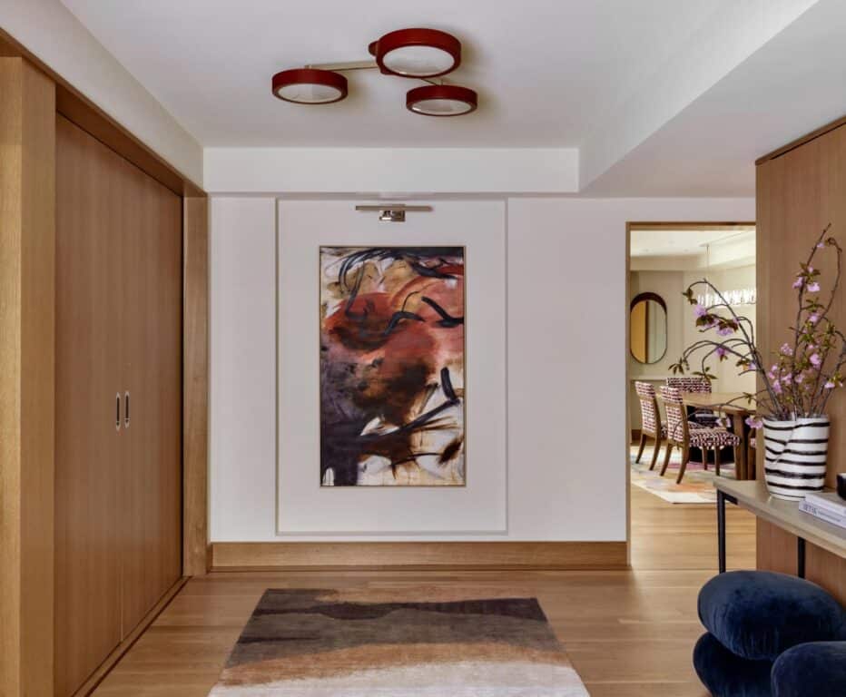
You enter the home’s spacious foyer and immediately you’re greeted with artwork on the opposite wall. The wall has a small inset and the piece is professionally lit. Overhead, a custom, low-profile ceiling light from Urban Electric mimics the pops of rouge in the artwork. “I’m a huge proponent of lighting,” says Meisgeier, who advises if your budget is limited, to put your money into lighting and materials like tilework.
Just The Right Touch
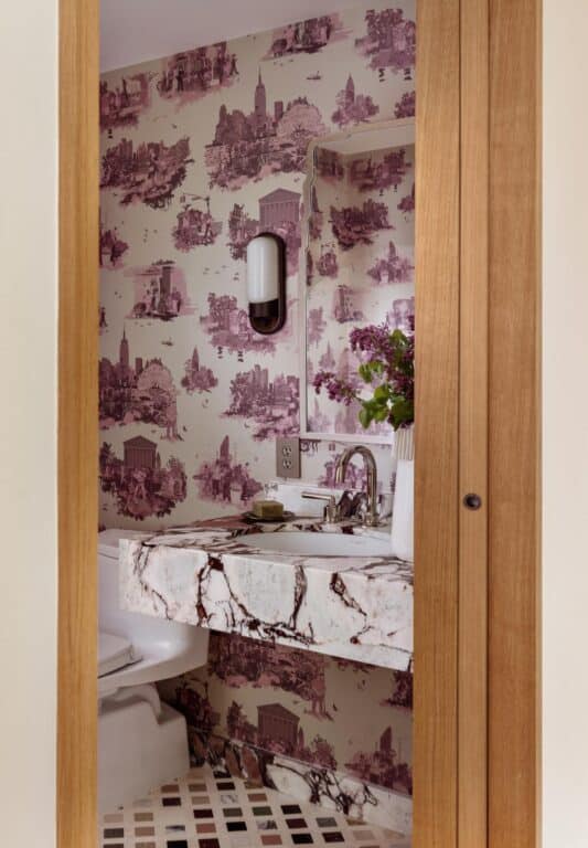
The couple loves color and pattern and Meisgeier wanted her design to reflect their taste. “They said the sky is the limit and honestly, it was that wallpaper in the powder room that I jumped off of,” says Meisgeier. “It’s a New York toile and I had discovered it years prior and just kind of fell in love.” The city vignettes are a cheeky blending of traditional and modern and she had been saving it for just this kind of a project. The homeowners loved it. “They really like red,” says Meisgeier.
An Open Concept
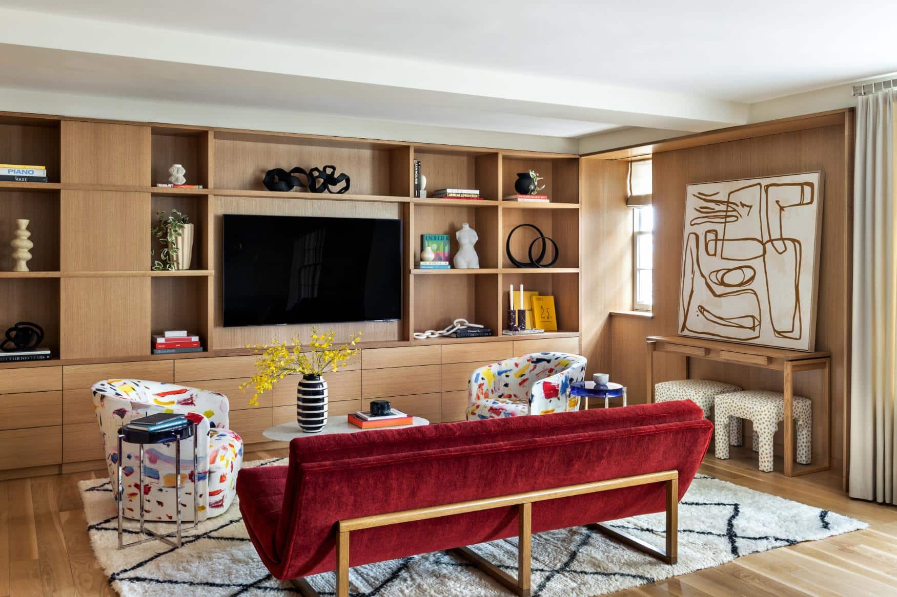
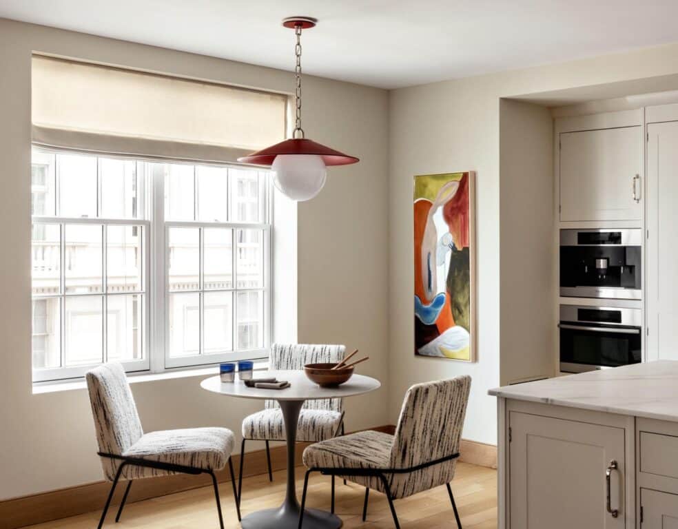
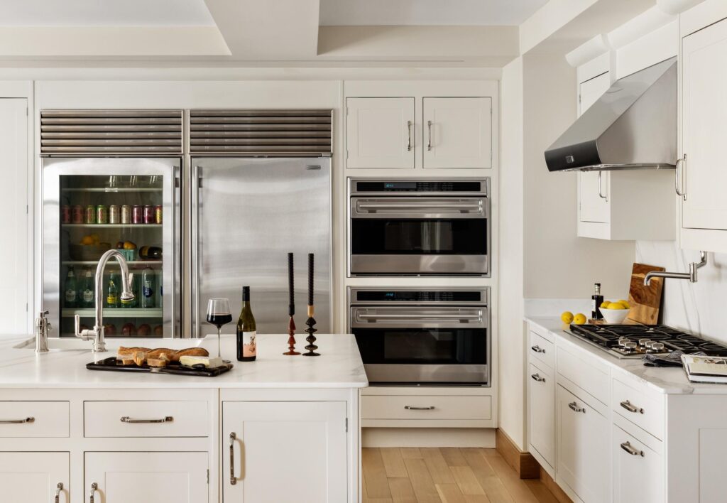
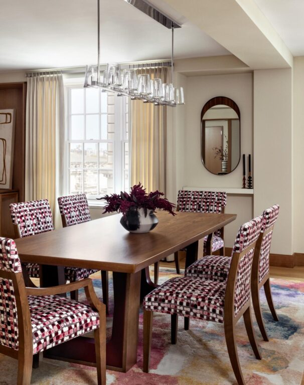
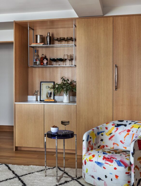
There was no dining room before Meisgeier reworked the layout. She removed the wall to the eat-in kitchen in order to open up the apartment and give them a dining space. Even though they have the same number of windows, more natural light enters the now open layout. She opted against traditional millwork to give the apartment a more contemporary feel. The main living space now contains an open living room, dining room and kitchen so these uses had to flow seamlessly together. She started with the sofa: a red mohair from Pierre Frey on a Lawson-Fenning frame, which she chose for its equal interest from front and back. The space used to contain lots of white MDF wall cabinetry, which all came out to be replaced with white oak built-ins. They give the space a warm and natural look and allow your eye to be drawn to the artwork and the pops of color in the fabrics. Two smaller swivel chairs in a Pierre Frey fabric called Tootie Fruity add a bit of pattern and pair with the red sofa. A Moroccan rug anchors the room and picks up the black and white in the chair fabric. The kitchen was in like-new condition because the previous owners didn’t live in the apartment or use the kitchen too much, so Meisgeier left it mostly as is intentionally. “We wanted to keep the kitchen neutral enough that it was calming to the eye,” she says. She chose an overhead light from Urban Electric that tied in the pop of red from the sofa, to hang over a small breakfast table. Small prints on the dining room chairs and kitchen chairs are abstract with bits of red and black to coordinate with the other fabrics in the space while not overpowering them.
Classically Modern
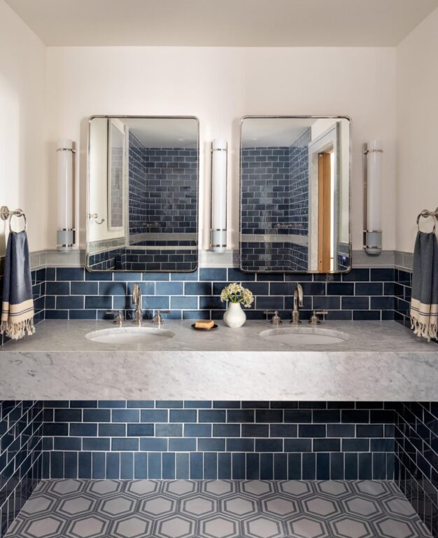
For the primary bathroom, she opted for classic subway tile in blue on the walls and a hexagon tile for the floor with polished nickel and blue framing a white center. The color is an unexpected and modern twist to two traditional shapes that give an Old New York boutique hotel vibe. “I wanted to respect the integrity of the original architecture of the building,” says Meisgeier.
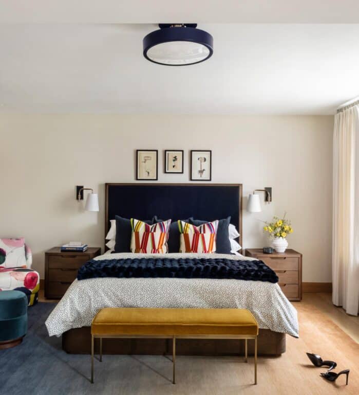
“I’ve always I’ve always been a proponent of pattern play and the use the bold colors to just create that wow factor, but I’ve been reined in with things that I really wanted to do in the past just because of either the clients not really wanting to go totally bonkers or it just not really fitting with the integrity of the architecture, but here I was like no holds barred, all bets are off,” she says, pointing to her clients’ willingness to take a few risks.
A Little Risk, Big Reward
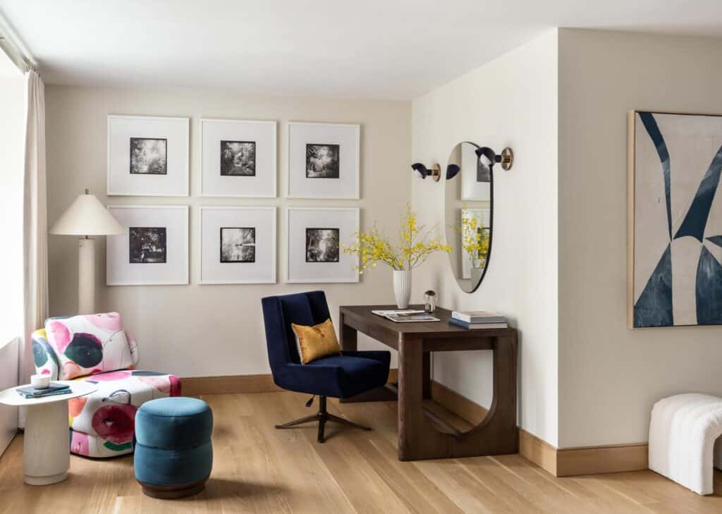
Because this apartment wasn’t going to be their primary residence, Meisgeier had a little freedom to get creative, not only with pattern and color but also with space. She removed a small walk-in closet that made the primary bedroom feel small. This opened up the room. The window in the closet now provided another source of natural light and the bump-out gave the feeling of a presidential suite. The room still has a traditional closet space, which suits her clients’ needs when they come to visit. She was also able to add a desk, which she sourced from Restoration Hardware, so her client has home office space when traveling.

Meisgeier says for each project, she aims to help guide and educate clients toward having a beautiful home, but it’s their taste and budget that dictates the final results. “When the project’s done, I close the door and move on, and this is the home that you get to live in. No two projects that are alike, there’s no two budgets that are alike, there’s no two clients that are alike, so I just want each project to be, ultimately, tailored and personalized to my clients’ style, their needs and their wants.”
SHOP HOME DECOR + MORE
Shop hand-picked products from our editorial team.