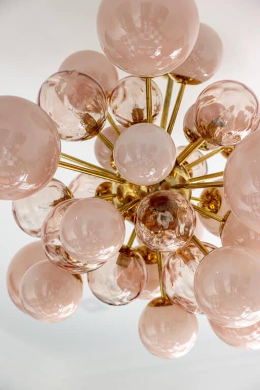
When Interior Designer Emily Shron found out she was having a second boy, she bought the large Italian chandelier of pink orbs to bring a touch of femininity to the almost all male household. “I wanted it to be the first impression when you walk in,” says Shron, who juxtaposes traditional and modern, expected and surprising details in her updated English Tudor-style home in Harrison, NY. “A lot of people who walk in will ask, ‘Did it take forever to do this?’ but I felt like this took me no time at all because I knew what I wanted, and it all just happened,” said the principal designer at Shron Design.
First and foremost, Shron wanted to bring the 100-year-old Tudor into the 21st Century. “This home had really good bones and cute elements like the windows that I didn’t expect to like, but I think what makes it interesting is embracing the architectural elements and highlighting them but not feeling confined to staying in that era,” she says. She wanted to make it feel fresh, modern and bold—elevated but cozy, not stuffy. To keep everything family friendly, she chose performance fabrics. “Every surface is highly cleanable,” she laughs.
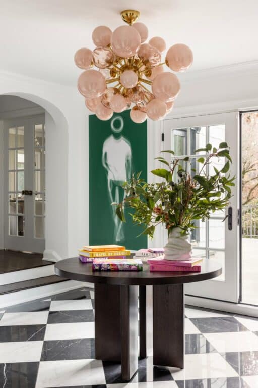
To achieve this personal aesthetic, Shron was able to make a few bold choices. She prioritized statement lighting and bold artwork. She started in the front hall with the Harlequin black and white floors that “could be from any era” says Shron, and paired them with the pink chandelier.
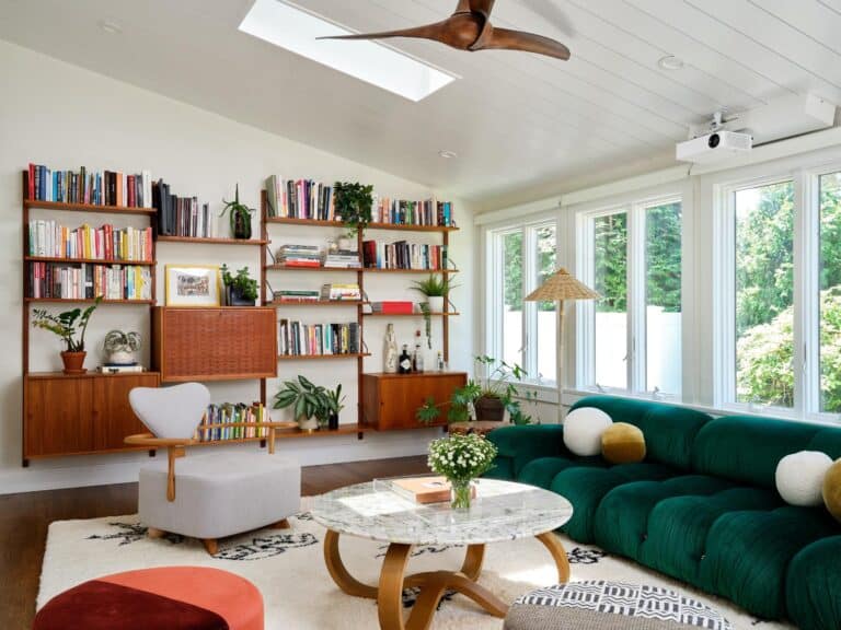
In her cozy family room, a u-shaped Mitchell & Gold sectional surrounded by big windows is paired with an organically shaped custom upholstered ottoman. “I was planning to have a coffee table there but decided I was just going to let it be and I did an upholstered ottoman that my boys play on and jump from there to the sofa. They are happy and I think it’s cool looking,” says Shron.
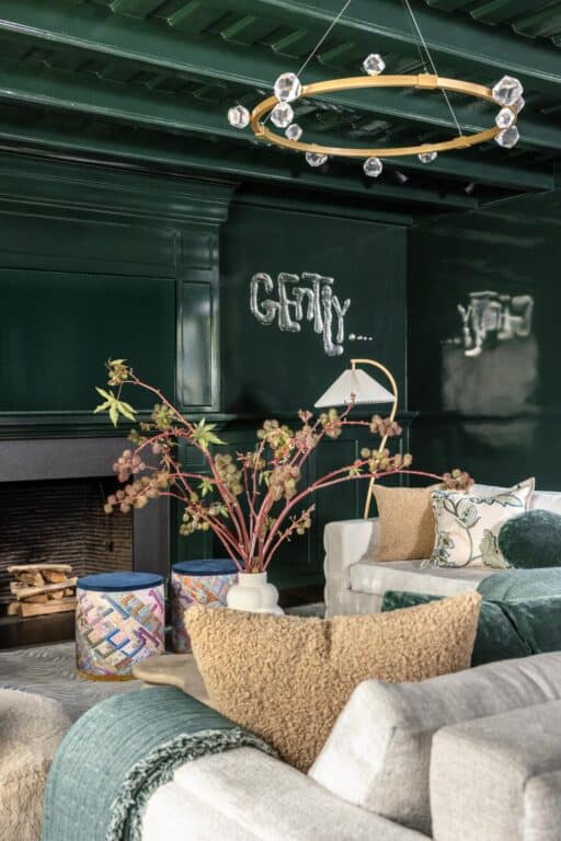
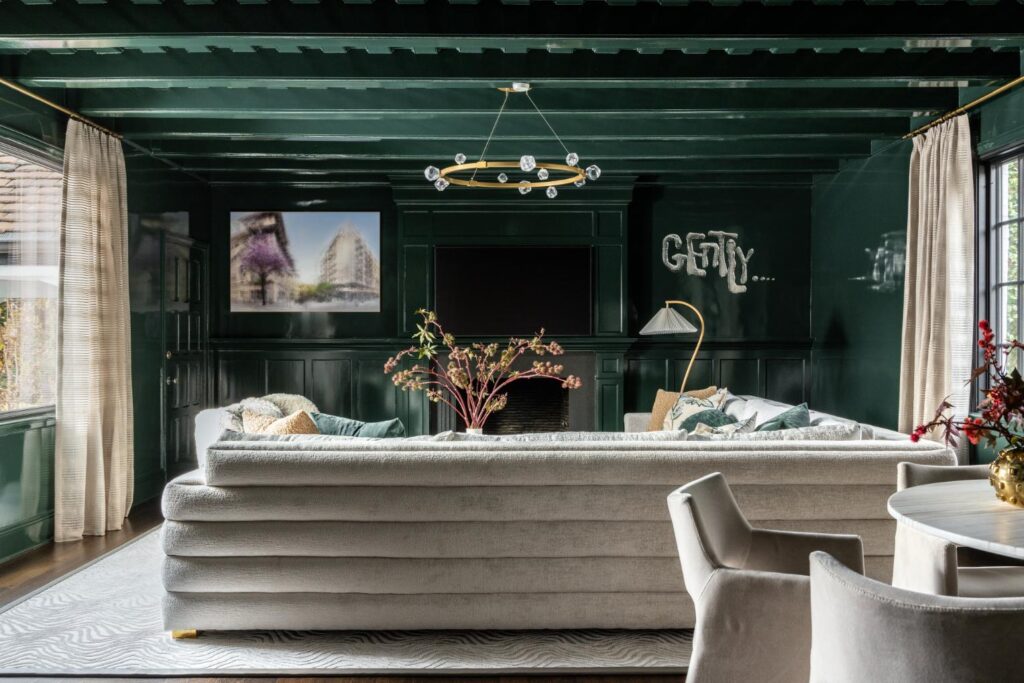
Her older son’s favorite color is green, which inspired her to color-drench the living room, including the ceiling, millwork and fireplace surround. Then selected furniture all in the same creamy off-white and drapes in a Holly Hunt Great Plains fabric. “Gently” artwork by Rob Wynne adds some whimsy to the aesthetic. “I wanted my space to feel happy and I want other people to feel happy when they are there,” says Shron. Much of her design choices involve bold punches of color and pattern in the artwork and accessories to make it “elevated but not too serious.”
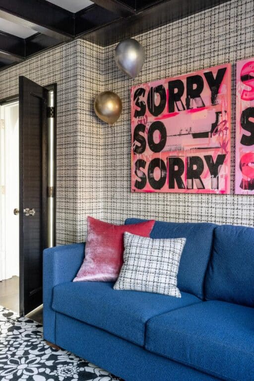
In her home office, Shron painted the millwork black and paired it with plaid wallpaper from Housewife Essentials. A blue sofa from Room and Board and some pink pop art from Layer Cake.
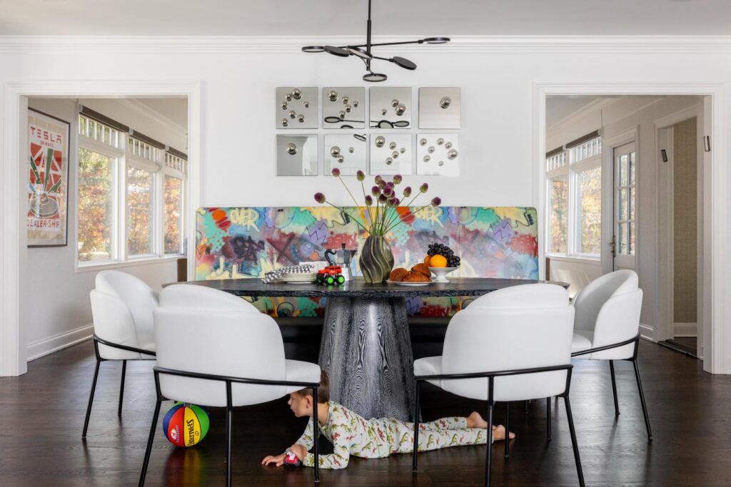
For another pop of color, the breakfast nook, with coordinating black and white chairs in a wipeable vinyl has a colorful bench adorned in a graffiti art Pierre Frey fabric that she had vinylized. The black and white round pedestal table from Worlds Away and a modern chandelier from Visual Comfort centers the space.
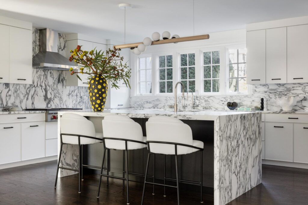
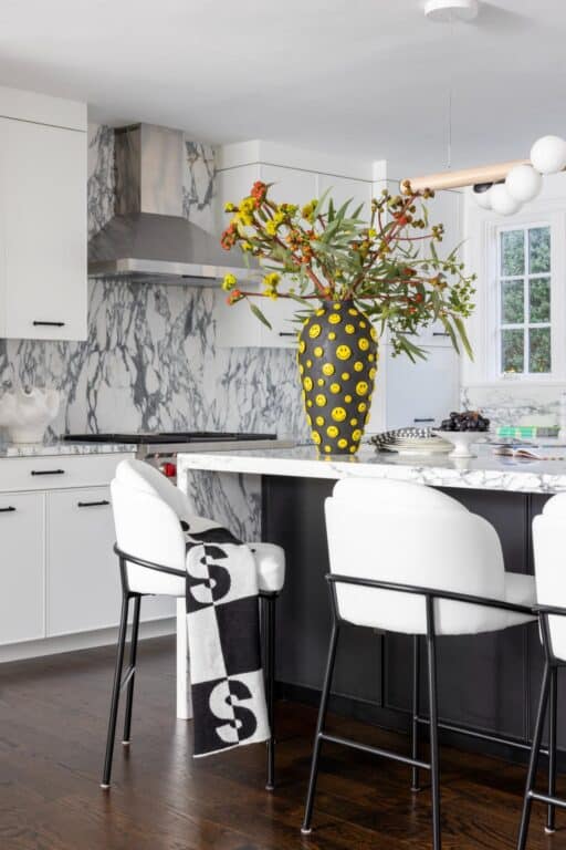
In the kitchen, a bright yellow smiley face vase sits on the large quartz waterfall countertop of the island, which matches the backsplash and countertop of the surrounding cabinetry. In the all-white and black kitchen, it’s a pop of color and a conversation piece when guests come over. Purchased from Batit Studio, an artist in Israel, it was, proportionally, a bigger expenditure than you’d expect for an accent vase, but as a design element, it’s the star of the room. “A lot of clients will say to me when I pitch them a design idea, ‘I never saw that done,’ which causes them to hesitate to go for an idea,” says Shron. “To me that’s the whole point of hiring a designer.”
She said the experience designing her own home and really pushing boundaries gave her more confidence when working with her clients. “It’s exciting striking a chord with a client,” says Shron, who combines new and existing pieces, sometimes giving things the client has new life, and other times, helping determine what needs to be purchased or donated. “It’s figuring out where my clients’ comfort level is, where we can push the boundaries and how they can use each room, so we are accommodating the family,” she adds. “I want to know people will be using and enjoying everything we design.”
Photography: Julie Leffell